Categories
2013 Art works 2013 Exhibitions Exhibitions IN ENGLISH Promoting your Art Videos Visual Jazz

An afternoon with Mr. Evans (and if it is in Paris, even better…)

billevanscover
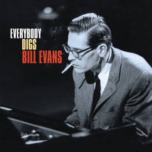
Bill Evans is one of those artists who are constantly present in my work.

This great piano genius was born in New Jersey, in 1929. He passed away in 1980 from health complications related to his hepatitis and his cocaine drug abuse, in what was described by a close colleague as “the longest suicide in history”.

At the height of his career, Evans was as emblematic to jazz and his instrument (piano) as Miles Davis was to the movement and trumpet playing.

He is seen as the main reformer of the harmonic language of jazz piano and was influenced by impressionist composers such as Debussy and Ravel. His versions of jazz standards, as well as his own compositions, always featured thorough changes to their original harmonies.  Musical features included added tone chords, modal inflections, unconventional substitutions, and modulations.

From Wikipedia:

Above is an example of Evans’s harmonies. The chords feature extensions like 9ths and 13ths, are laid around middle C, have smooth voice leading, and leave the root to the bassist. Bridge of the first chorus of Waltz for Debby (mm.33-36). From the homonymous album of 1961.

One of Evans’s distinctive harmonic traits is abandoning the inclusion of the root in his chords, leaving this work to the bassist, played on another beat of the measure, or just left implied. “If I am going to be sitting here playing roots, fifths and full voicings, the bass is relegated to a time machine.” This idea had already been explored by Ahmad Jamal, Erroll Garner, and Red Garland. In Evans’s system, the chord is expressed as a quality identity and a color. Most of Evans’s harmonies feature added note chords or quartal voicings.

Thus, Evans created a self-sufficient language for the left hand, a distinctive voicing, that allowed the transition from one chord to the next while hardly having to move the hand. With this technique, he created an effect of continuity in the central register of the piano. Laying around middle C, in this region the harmonic clusters sounded the clearest, and at the same time, left room for contrapunctal independence with the bass. Evans’s improvisations relied heavily in motivic development, either melodically or rhythmically.Motives may be broken and recombined to form melodies. Another characteristic of Evans’s style is rhythmic displacement. His melodic contours often describe arches.Other characteristics include sequenciation of melodies and transforming one motive into another.

Beyond his brilliance as a pianist and musician, and his technical excellence, Evans managed to imbue his music with a such warmth and melancholy that listening to him playing, even today, generates a deep emotional vibration.

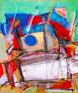
This new work of mine, from 2013 and simply called “An afternoon with Mr. Evans” is one more of the many jazz and Evans inspired works in my own artistic repertoire.

An afternoon with Mr. Evans_2013_50x65 b
AN AFTERNOON WITH MR. EVANS (2013), ACRILYC, INK AND OIL BASED PAINTS ON CANVAS, 50CM X 65CM, c Copyright 2013 Ignacio Alperin

I leave you while I hope you enjoy these next few minutes listening of this genius playing live in 1972 .

See you next time.

Ignacio

Awesome_1369282416164_edited1


©Copyright 2014 Ignacio Alperin


Advertisement
Categories
2008 art works 2009 art works 2010 art works 2011 art works 2011 Exhibitions 2012 art works 2013 Art works 2013 Exhibitions Design Exhibitions IN ENGLISH Visual Jazz

Ñ, that weird little letter which may well define the Spanish language, and its role in an undefined coffee table

logo enieThe most popular and competing Western languages in the world are English and Spanish.

For the Spanish speaker, the letter Ñ (roughly pronounced N-ee-A ) is like a symbol of this language´s uniqueness.

In Argentina, the top selling literature, arts and culture magazine, edited by CLARIN (the country´s most popular and largest selling newspaper) is properly called simply “Ñ”.

Yes, just a letter, but one that is the symbol of a whole language.IAB_PAG_6_Ñ_25MAYO2013

This magazine is published every Saturday and has average weekly sales of approximately 80,000 copies. Ñ, together with the LA NACION´s newspaper ADN (DNA in Spanish, and a different and perhaps more modern way of asserting where its cultural roots are), are the 2 most popular cultural magazines in the country.

I have been privileged enough to have been featured in both at different times, and it is always a proud moment when I can see my work reproduced in such prestigious and popular publications, and particularly when I find myself surrounded by articles on truly amazing local and international artists.

Last Saturday (May 25th ) I was surprised to find my latest intervention, and what has become so far this year´s one of my most popular works (my “Crystal coffee table with color pencils”), being featured on page 6.

renieIt is always fun to see how a writer approaches a piece of work. I still remember a short article in the same magazine a couple of years ago, in which a journalist with immense generosity, compared and intertwined my work in my “Visual Jazz Series” with Julio Cortazar´s writings and his love for Jazz (for an explanation of how my art and music are interconnected, and particularly Jazz, check out “Jazz means freedom” at http://wp.me/pN8b8-9s  ).

This time the reporter took a more clinical approach, which oddly enough I feel it is the right way to look at the piece.

First of all, because only a live viewing will reveal a certain depth and 3 dimensionality, that cannot be explained through a photograph. Secondly, because the piece is intriguing and that fuzziness is better left for the viewer to unravel, rather than subject it to an explanation that can only partially encompass all that it has to offer.

IAB_PAG6_Ñ_25MAY2013

And I can only invite you, if you can, to have a look at it live at the Buenos Aires Design Shopping Mall, where it will be on show for a little while longer. And if you can´t, do not worry, at the very least I have some great pictures from the great Fabian Cañás which I have published here previously and on Facebook for you to look at and enjoy. I hope you do.

Until the next time.

Ignacio

Clarin_20130528_ARQU10_4_4_F1

—————

Follow Ignacio on…

Twitter: www.twitter.com/ignacioalperin

Facebook: https://www.facebook.com/#!/pages/Contemporary-Artist-Ignacio-Alperin-Bruvera/147225685298260

Categories
2008 art works 2009 art works 2010 art works 2011 art works 2011 Exhibitions 2012 art works 2013 Art works 2013 Exhibitions Design Exhibitions IN ENGLISH Visual Jazz

ART, SUIT & TIE

As everyone who knows me  (www.ignacioalperin.com) knows, I am a maker of art and a lover of both art and music, particularly jazz and all its variations.

I have always endeavored to put both artistic forms of expression together, looking to synthesize them into new creations.iab_suit&tie

I have managed to do my own thing, but my love for the works of great geniouses like Kandinsky, Picasso, Van Koenig, Rauschenberg, and Pollock amongst others, will show through.

In music, even though my tastes are usually expressed in terms of the great bebop and hard bop masters like Evans, Coltrane, Monk, Davis, Pepper, Bird, and the golden era of American voices like Ella, Sinatra, Bennett, Dinah Washington, and Nina Simone, I am quite eclectic. I love classical music, tango, blues, soul, hip-hop and I can find inspiration in almost any tune that I enjoy, no matter its style.

Like I always say, music deserves a great deal of the credit in my art. “Inspiration is easy to find when you are perched on the shoulders of genius” is my usual response. 

As I slowly entered into the realm of object design and sculpture, music was also there to inspire me, to make me “see”.

IABCRYSTALTABLE2013-5

As many of you have seen, I recently introduced my latest piece at Art Deco, an Exhibition of intervened objects by well known Argentine artists, which took place at the Recoleta district in Buenos Aires in late April.

My design is quite simple. An all crystal coffee table within which, just like a transparent jewel box, In which I placed a sculptural piece made up of more than 1800 Faber-Castell Goldfaber artistic pencils standing perpendicularly and making up a colorful and airy version of the painting that lurches beneath.

 It strikes me that every person, whether young or old, who has stood in front of the finished table ends up drawing out a big and happy smile. The color pencils create a link to something very familiar, something warm within each one of us, and initiate the communication with the viewer immediately.

This slideshow requires JavaScript.

The idea of using pencils for this intervention came to me as I watched a Tony Bennett documentary a while back. I already had the crystal table and listening to that genius sing made me close my eyes, and suddenly I saw it. It was like a clear box full of candy, the idea of the beautiful color pencils used as objects d’art instead as of instruments was born. I know others have explored this avenue, but I think I have managed to make it both artistic and utilitarian, with a cool twist. I am happy with the results and with the reaction of the public. It has been a wonderful experience.

And to me, it is important that my art also has that COOL factor. It is a style and it is a message. Art is not something rigid, stuck somewhere in an impregnable limbo. It is something to be enjoyed. My art is a message of fredom and cool, for all to enjoy, in any way they wish to enjoy it.

And of course, preferably at home, after acquiring it!!!  🙂

And talking about cool, enjoy the images of my latest work while you listen to  the new 60’s Jazz scene B&W video of Justin Timberlake’s latest (featuring Jay Z). It seems that JT, just like me, also likes doing his thing with a Suit & Tie.

Until the next time!

Ignacio

—————

Art and Design: Ignacio Alperin Bruvera 

Photos: Fabian Cañas.

Painting accompanying the table in photos: “Let´s get away from it all” (2012) by Ignacio Alperin Bruvera, 100cm x 100cm.

Let´s get away from it all 100x100 (2012)

Follow Ignacio on…

Twitter: www.twitter.com/ignacioalperin

Facebook: https://www.facebook.com/#!/pages/Contemporary-Artist-Ignacio-Alperin-Bruvera/147225685298260

Categories
2008 art works 2009 art works 2010 art works 2011 art works 2011 Exhibitions 2012 art works 2013 Art works 2013 Exhibitions Design Exhibitions IN ENGLISH Visual Jazz

A crystal table filled with an object made up of 1800 color pencils in an artistic intervention (from the Press Release)

Argentine contemporary artist Ignacio Alperin Bruvera has been in the news lately.

 An already established artist with international exhibitions on his resume, Alperin has explored the pictorial side of music withCount Basie and Frank Sinatra his long standing “Visual Jazz” series.

A lover of art and music since an early age, particularly jazz and all its variations, he has always endeavored to put both artistic forms of expression together, looking to synthesize them into new creations.

The result is a well recognized style, art that has a hidden and well rehearsed structure within a sea of improvisational skills, rhythms, colors and cadences.

 His art is very personal, baroque at times, simplified and beautifully succinct at others. His works takes on many forms, and yet his hand and his vision is always recognizable.

 Alperin was born in Argentina, grew up in Australia, and circumstantially lived and traveled thIAB_UNTITLED_80X70CM_(2012)smlrroughout Europe, America and South East Asia.He professes an early love for masters like Kandinsky, Picasso, Van Koenig, Rauschenberg, as well as admiring the clinical genius of Leonardo. His musical tastes were centered around Jazz, blues and classical, but his heart was mostly with the great bebop and hard bop masters like Evans, Coltrane, Monk, Davis, Pepper, Bird, and the golden era of American voices like Ella, Sinatra, Bennett, Dinah Washington, and Nina Simone.

 He says that the music deserves the credit for his art. “Inspiration is easy to find when you are perched on the shoulders of genius” he often asserts

In recent times he has slowly entered into the realm of object design and sculpture.

Diving into art and design: The Table

IABCRYSTALTABLE2013-5 

He recently introduced his latest piece at Art Deco, an Exhibition of intervened objects by well known Argentine artists, which took place at the Recoleta district in Buenos Aires in late April.

His design is exquisitely simple. An all crystal coffee table within which, just like a transparent jewel box, he has placed a sculptural piece made up of more than 1800 Faber-Castell Goldfaber artistic pencils standing perpendicularly and making up a colorful and airy version of the painting that lurches beneath.

 IABCRYSTALTABLE2013 AND PAINTING-1

The result is a masterfully creative piece, almost constructivist, full of tridimensionalities, nuances, shadows, and optical illusions. There is substance and lightness, color and darkness, and above all a joyful sensation of being in front of something that is creative and new, yet familiar.

This slideshow requires JavaScript.

From the author:

IABnarrow

It strikes me that every person, whether young or old, who has stood in front of the finished table ends up drawing out a big and happy smile. The color pencils create a link to something very familiar, something warm within each one of us, and initiate the communication with the viewer immediately”.

The idea of using pencils for this intervention “came to me as I watched a tony b wit LGTony Bennett documentary a while back. I already had the crystal table and listening to that genius sing made me close my eyes, and suddenly I saw it. It was like a clear box full of candy, the idea of the beautiful color pencils used as objects d’art instead as of instruments was born. I know others have explored this avenue, but I think I have managed to make it both artistic and utilitarian, with a cool twist. I am happy with the results and with the reaction of the public. It has been a wonderful experience.”

To me a color pencil is like a time machine. It is one of the very first objects that we consciously remember from an early age. It is a magic wand that explodes in colors and lines. It is something that accompanies us throughout our lives. A great grandfather in his 80s will pick up a box of color pencils and for a moment, he will be a 2 year old again. That is the time machine aspect I refer to. It is a connection with something very essential and very warm within us, and a vehicle that takes us to whatever point in our lives we want to go.”

A gentleman told me at the exhibit that whenever he opened a new box of color pencils with his grandchild, the smells and the sounds of those colorful wooden sticks would just make him happy and warm all over. Something like that is what I was looking for with this intervention and those who view it. I hope I managed to achieve it”.

Art and Design: Ignacio Alperin Bruvera 

Photos: Fabian Cañas.

 Painting accompanying the table in photos: “Let´s get away from it all” (2012) by Ignacio Alperin Bruvera, 100cm x 100cm.

Follow Ignacio on…

Twitter: www.twitter.com/ignacioalperin

Facebook: https://www.facebook.com/#!/pages/Contemporary-Artist-Ignacio-Alperin-Bruvera/147225685298260