A personal, curatorial & bilingual Blog about: Artistic Movements, my Art, Creativity, Innovation, Design, Leadership, Empowerment, Sustainability, Science, Jazz, Movies and other cool pursuits - Blog personal y curatorial bilingüe sobre: Movimentos Artísticos, mi Arte, Creatividad, Innovación, Diseño, Liderazgo, Empoderamiento, Sustentabilidad, Ciencia, Jazz, Películas y otros temas.
If you look it at it from the point of view of sheer gratification, few things that you will buy for your house at a reasonable price will give you more enjoyment and for such a long time.
What are the chances that your sofa will increase in price over time? (Yes, I mean after use).
Not many? How about close to none?
What are the chances that a painting you bought for anywhere between $500 and $5000 will increase in price over time?
Well, you don´t have the best odds but it can and it does happen. Anywhere higher than $4,000 and your odds get better, and those you purchase at prices that go anywhere from $5,000 to $15,000 have probably very good odds of maintaining and increasing prices.
So, if you have a keen eye and good luck, your purchased art work may double, triple, or multiply its original price many times over.
Now, it is important that you keep it, remember where it is, and pass it over to the next generations. Otherwise what could happen to you is what happened to the unknown original owner of the painting “Preparation for Egypt” (which is thought was painted somewhere between 1605 and 1620). A German student in Berlin was looking for an old sofa for her appartment and decided to buy a pullout couch at a flea market. When she opened it, the painting was inside. It went on to be purchased by an anonymous bidder at auction in Hamburg for a price of $27,630, making the student about 100 times what she originally paid for the couch. So the lesson is to keep your art close, protected, in your will so you can pass it on to others, and definitely, do not hide it in a sofa (no matter how much you like the sofa).
If you are a betting person, always spend a little more (with good and knowledgeable advice is always better) as price in art relates to how the market views the artist (obviously, a higher price acts as an initial validation of the art work). But this is not a must.
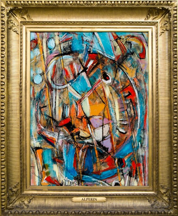
LITTLE TUNES 21 (2012) by Ignacio Alperin
You can find great deals amongst emerging as well as established artists. In my case, I make the point of always of having paintings available below $5,000 (sometimes as low as $1,500 or even less for small pieces), as my interest is that my art get to as many hands as possible. I love having someone buying something for $1,000, and then seeing that person 6 months later with a smile on his or her face because not only they love their painting, but they know they have already made a profit on it as well.
They are my best marketing people. I love the fact that they like my art, and I love seeing them talk about how much they enjoy a particular painting. And I am not alone in this pricing strategy. A great number of artists share this attitude towards the market.
So, if you are looking for enjoyment, originality, a smart and lasting gift for yourself and for the people you love and esteem, as well as a chance at making a handsome profit just for having a keen eye, you cannot do much better than buying art.
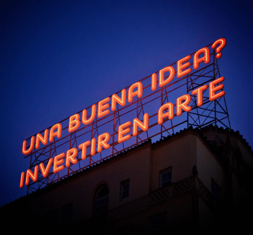
And as long as we are talking about smart things to do, I recommend you listen to this album. It is just another good idea.
Murray Gell-Mann is an American physicist. A friend and colleague of Albert Einstein, he received the 1969 Nobel Prize in physics for his work on the theory of elementary particles.
He is now 86 and still going strong. He is obviously famous for his scientific studies and most importantly, he is basically known as the father of the “Quark”, which is the name he gave to a minute particle which is a fundamental building block of neutrons and protons, and which he found has very unusual properties.
He also loves delving in other subjects such as linguistics, archeology, and he even expands his views and opinions on the subject of creativity and innovation. During my seminars at the University I draw a great deal of inspiration from some of his very clever ideas. First and foremost, the fact that the Universe is one, and we are part of it. And as part of such a large event, we follow necessarily certain rules that are common to everything that exists within it.
Gell-Mann is not alone. It is not uncommon to hear physicists or mathematicians – even Stephen Hawking, Albert Einstein, Sir Issac Newton before them, and even Aristotle way before all of us – refer to the beauty, simplicity or elegance of equations or theorems and how these characteristics tend to be a good omen that a correct formula is close by (Newton said, for example, that “Nature is pleased with simplicity” while Aristotle made a point in favor of simplicity by advocating as few as possible postulates).
Gell-Mann always tells the story about his 1957 theory on the weak force which he and his colleagues decided to publish. They did so even though it went against seven well know experiments which said something very different. According to him, they did it because they obviously thought they were correct, but the indication that this was so was just the fact that, to them, their answer was a simple one while the other, which was the accepted reasoning, was convoluted and ugly. In time it was shown that Gell-Mann and his friends were correct and all known experiments at the time were wrong.
I always tell my students that simplicity is at the core of all successful enterprises, while overly complex concepts tend to have a much lower success rate, and in the case of initial success, relatively low survival rate. By simplicity I also mean organic, natural, intuitive.
A common example for this, believe it or not, is Facebook.
The core architecture of Facebook is so simple that it almost shocks those who sit down to analyze it for the first time.
I don´t know if it is still going on, but a well-known fact happening at Facebook for a long time was that on the first day of work at the company, the VP of Product, Chris Cox, would give newcomers a remarkable introductory talk. In it he would focus, amongst other things, on explaining Facebook´s product architecture and how it relates to the mission of the company.
When we talk about a company´s architecture, we mean the building blocks of a company, its structure, and how these objects relate to each other and with each other.
Cox, moved by great minimalistic aptitude, describes it in the case of Facebook, as a directory of people, their friends, and their interests; plus a directory of businesses, from global brands all the way to small local businesses. Plus, on top of those directories, a thorough map which basically shows the relationships that exist between all those things. That´s it. No more or less. And that summarizes Facebook.
And it can´t be denied that it is a crystal clear formulation of the product, directly relevant to the mission the company has set, and above all, easily understood by anyone who sees it. It is “beautiful”, it is “elegant”, it is in line – within the corporate cosmos – with Albert Einstein’s famous remark about the fact that he had faith in that “the principle of the universe will be beautiful and simple.”
As far as company´s architectures go, it is beautifully simple, and it is organic to the extent that it is following our everyday interactions, which occur naturally in society, and in doing so it is also helping us to make them richer.
Now, to the big question. Is then the claim that beautiful and elegant answers, as proclaimed by scientists and partially concurred by many who deal in many diverse professions – including myself -, factual evidence or there may be more mundane explanations for this? Does apparent simplicity explain itself or does it hide something else within the underlying structure of reality? Or can it simply be explained by way of sociological, psychological or practical considerations?
Just from the above enumeration of possibilities one gets the distinct notion that things are not that “simple” in “simple answers”.
For a start, it is important to notice that the aesthetics of equations is quite deceiving. An answer may not be convoluted in terms of steps or length because many symbols, which make it look short and “elegant”, involve within their meaning, long and complex equations. What is hidden in all derivative operations is nothing less that long and complex definitions. Thus the “appearance” of simplicity may hide great deal of complexity, and it usually does.
But does this vitiate the argument that “simplicity and elegance” is a good sign in regards to proper and workable solutions?
While mathematicians compress very complex ideas in easily understood symbols, life itself does a bit of the same.
When I say someone is “good”, as opposed to someone who is “evil”, what am I really saying? The concept of “good” requires of a long, and usually difficult to agree, definition. Many philosophers and theologians have spent their lives looking for a formal demarcation without definite agreement. Yet it is one of the most used words, and therefore concepts, in any language.
What has happened is that common consensus has looked to “simplify” its meaning. It is probably an acceptable explanation that a good man
A commonly accepted “Good Man” (as well as “nice & jolly”)
tends to be the sum of the specific interactions between the idea of a person who (generally speaking) does not act against his fellow men, with one who (mostly) acts in a responsible manner, and one who has a certain degree of solidarity, honesty, and social conscience. May also involve concepts such as being a respected and loving father, brother, son, husband, or friend. And so on.
The definition involves a series of terms which act in the same manner as arithmetical “derivatives”, and when put together, they come up with a symbolic word which makes a very intricate but widely acceptable concept into something “simple and elegant”.
The same can be said of anything. Our day to day life involves a constant oversimplification of complex concepts. The oversimplification factor can overlook many nuances but it also makes concepts easily understood and shared by all, and sharing is one of the key factors which make a society into a healthy and growing civilization.
So is simplicity merely the expression that intricate concepts acquire when consensus generates a commonly agreed, albeit limited, explanation? Everything seems to be pointing that way. A flower is a flower but depending on the level of complexity I wish to analyze it, it is a flower or it is something so complex that only a molecular physicist, biologist and botanist can muster.
If it is then a matter of socially acceptable definitions? Can then simplicity be merely described in sociological terms? Is it just a mirage in a wide desert of concepts as abundant as grains of sand? The answer may be resting somewhere in between.
In the same way that the concept of the Universe can be explained in fairly simple and elegant terms, it can also be described as the most complex conjunction of situations, equations, “random coincidences”, and an uncertain prequel and origin we have been able not to ever explain at this time.
Simple answers thus generally hide extremely complex definitions, equations or layered responses which no longer need to be probed as their terms are generally accepted, or because the general description is acceptable on its own terms even if one sees or intuits that a more complex situation lies beneath the surface.
“Simplicity and elegance” may be then a matter of communicating the commonly accepted “look and feel” of something in a terminology that is understood by most at a specific period of time.
As an artist I see this in my own work, and an example of this may be a good way of making graphic something that by now seems so philosophical.
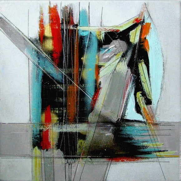
The general perception of a painting may hide a complex underlying theme or pictorial development. Take for example Epistrophy, my painting from 2015.
“Epistrophy” (2015) – Ignacio Alperin
On the surface it seems a conjunction of fairly geometrical forms in, mostly, 4 colors: blacks, ochres, blues and reds. Not that it can easily be understood, but the composition seems elegant and fairly simple. The shapes are fairly geometrical and providing an initial look of something urban, perhaps somewhat adjacent to a constructivism gone a little haywire.
After a longer period of study other things become obvious. There are also perspectives involved. In fact, there are more than 6 purposely conflicting perspectives, including 2 conflicting curvilinear perspectives implicated. The colors are also more than just 4. There are more than 45 colors involved plus their shades.
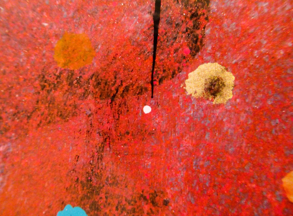
But even in each apparently “solid color”, which can seemingly be described as a red, or an ochre, or blue, there is an immense complexity of detail which gives to the eye the idea of one solid color. There is a minute, almost microscopic world of art, which lives beneath the apparent simplicity of one solid, elegant, simple description of color and which comes to life thanks to macro photography.
This slideshow requires JavaScript.
This is not a fluke. It is in fact by design. And this level of complexity and detail can be found, as I can demonstrate here below with some oher samples, in all of my paintings underneath the superficial explanation of its contents.
This slideshow requires JavaScript.
Thus, apparent simplicity hides a great deal of complexity that most, unless looking for it specifically, need not know. The simple answer exists and it is satisfying by itself. The complexity behind it also exists, and needs only to be known when the simple answer does not satisfy us.
So, having seen that simple and elegant may not be that simple or elegant beneath the surface, is the “simple and elegant answer” rule a good guide?
Even with all the questions still hanging around the subject, I would nevertheless venture to say “Yes”. It is a reasonable model to follow.
There are many reasons but I will just stick to these 4:
In my experience, the answer which simplifies the steps which need to be taken as well as the reasoning behind it, has a tendency to be more widely understood and therefore, more likely to be put into action. And an answer which is widely applied is, by its own definition, probably a correct answer at the time.
An explanation which simplifies a complex issue, and thus adds a certain elegance in a response, is very often the result of relating different occurrences to a single cause. Therefore eliminating unnecessary steps and making the response more widely applied as well.
Concurrently, longwinded, complex (“ugly”), and hard to understand answers or solutions will be more difficult to apply or prove, and thus less likely to be widely adopted, no matter their level of correctness.
This may be cheating, but many scientists and mathematicians have a rule of thumb. Known as Occam’s Razor (so named – or rather misnamed – for the English monk William of Ockham (or Occam), c.1285-c.1349 AD), this concept stands on the idea that if there are multiple plausible explanations for something, the simplest one will probably be the correct one. To avoid reductionism, one should add that this rule has a proviso that says “all things being equal”. In other words, it is mostly correct as long as you do not compare answers that put face to face bananas and apples.
So, is this becoming a dichotomist argument? Are we facing-off ugly vs elegant, or simple vs complex in an impossible battle? In reality, and as we have seen, what seems simple also hides intricacy. As a matter of fact, mothing in life is that easy, but almost everything should be approachable if explained in certain understandable terms. There is no battle here, but there is a probable winner nonetheless.
Whether in business, art, nature, mathematics or life itself, what we understand as answers that are, in relative terms, simple (ie: understandable, elegant, beautiful, non-repetitive, wider scoping, and so on) do run with an advantage over those seen as complex (difficult to fathom, convoluted, repetitive, ugly, non-organic, and so on).
“Simple” – elegant- answers hide within their nature the inherent complexity of life itself, but manage to show their results in a way that satisfy most. And as such, they tend to provide us with a healthy guide towards the right path. Furthermore, and coincidentally, being on the right path tends to also always be a beautiful experience.
City life gets to be too hectic sometimes so, isn’t it nice when we can get our selves freed from everything, and just let go, do something crazy like freeing some colorful balloons in a park and seeing them rise, or simply grab a loved someone by the waste and just like a superhero, point towards the sky and just shout… Let’s get away from it all!… and just fly away (I admit, that is definitely the difficult part).
Well, I know, none of it is as easy as it sounds, but you can certainly look at this painting hanging on your wall and think…I can do that.. 🙂
The most popular and competing Western languages in the world are English and Spanish.
For the Spanish speaker, the letter Ñ (roughly pronounced N-ee-A ) is like a symbol of this language´s uniqueness.
In Argentina, the top selling literature, arts and culture magazine, edited by CLARIN (the country´s most popular and largest selling newspaper) is properly called simply “Ñ”.
Yes, just a letter, but one that is the symbol of a whole language.
This magazine is published every Saturday and has average weekly sales of approximately 80,000 copies. Ñ, together with the LA NACION´s newspaper ADN (DNA in Spanish, and a different and perhaps more modern way of asserting where its cultural roots are), are the 2 most popular cultural magazines in the country.
I have been privileged enough to have been featured in both at different times, and it is always a proud moment when I can see my work reproduced in such prestigious and popular publications, and particularly when I find myself surrounded by articles on truly amazing local and international artists.
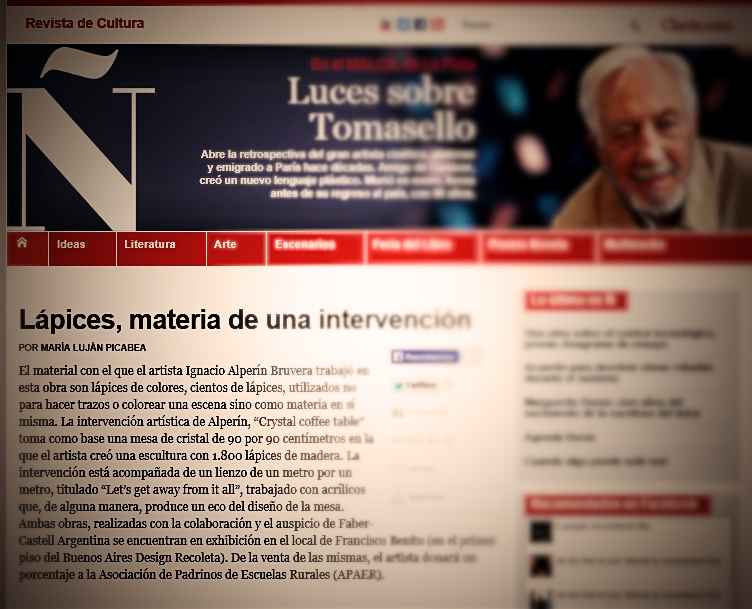
Last Saturday (May 25th ) I was surprised to find my latest intervention, and what has become so far this year´s one of my most popular works (my “Crystal coffee table with color pencils”), being featured on page 6.
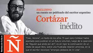
It is always fun to see how a writer approaches a piece of work. I still remember a short article in the same magazine a couple of years ago, in which a journalist with immense generosity, compared and intertwined my work in my “Visual Jazz Series” with Julio Cortazar´s writings and his love for Jazz (for an explanation of how my art and music are interconnected, and particularly Jazz, check out “Jazz means freedom” at http://wp.me/pN8b8-9s ).
This time the reporter took a more clinical approach, which oddly enough I feel it is the right way to look at the piece.
First of all, because only a live viewing will reveal a certain depth and 3 dimensionality, that cannot be explained through a photograph. Secondly, because the piece is intriguing and that fuzziness is better left for the viewer to unravel, rather than subject it to an explanation that can only partially encompass all that it has to offer.
And I can only invite you, if you can, to have a look at it live at the Buenos Aires Design Shopping Mall, where it will be on show for a little while longer. And if you can´t, do not worry, at the very least I have some great pictures from the great Fabian Cañás which I have published here previously and on Facebook for you to look at and enjoy. I hope you do.
As everyone who knows me (www.ignacioalperin.com) knows, I am a maker of art and a lover of both art and music, particularly jazz and all its variations.
I have always endeavored to put both artistic forms of expression together, looking to synthesize them into new creations.
I have managed to do my own thing, but my love for the works of great geniouses like Kandinsky, Picasso, Van Koenig, Rauschenberg, and Pollock amongst others, will show through.
In music, even though my tastes are usually expressed in terms of the great bebop and hard bop masters like Evans, Coltrane, Monk, Davis, Pepper, Bird, and the golden era of American voices like Ella, Sinatra, Bennett, Dinah Washington, and Nina Simone, I am quite eclectic. I love classical music, tango, blues, soul, hip-hop and I can find inspiration in almost any tune that I enjoy, no matter its style.
Like I always say, music deserves a great deal of the credit in my art. “Inspiration is easy to find when you are perched on the shoulders of genius” is my usual response.
As I slowly entered into the realm of object design and sculpture, music was also there to inspire me, to make me “see”.
As many of you have seen, I recently introduced my latest piece at Art Deco, an Exhibition of intervened objects by well known Argentine artists, which took place at the Recoleta district in Buenos Aires in late April.
My design is quite simple. An all crystal coffee table within which, just like a transparent jewel box, In which I placed a sculptural piece made up of more than 1800 Faber-Castell Goldfaber artistic pencils standing perpendicularly and making up a colorful and airy version of the painting that lurches beneath.
It strikes me that every person, whether young or old, who has stood in front of the finished table ends up drawing out a big and happy smile. The color pencils create a link to something very familiar, something warm within each one of us, and initiate the communication with the viewer immediately.
This slideshow requires JavaScript.
The idea of using pencils for this intervention came to me as I watched a Tony Bennett documentary a while back. I already had the crystal table and listening to that genius sing made me close my eyes, and suddenly I saw it. It was like a clear box full of candy, the idea of the beautiful color pencils used as objects d’art instead as of instruments was born. I know others have explored this avenue, but I think I have managed to make it both artistic and utilitarian, with a cool twist. I am happy with the results and with the reaction of the public. It has been a wonderful experience.
And to me, it is important that my art also has that COOL factor. It is a style and it is a message. Art is not something rigid, stuck somewhere in an impregnable limbo. It is something to be enjoyed. My art is a message of fredom and cool, for all to enjoy, in any way they wish to enjoy it.
And of course, preferably at home, after acquiring it!!! 🙂
And talking about cool, enjoy the images of my latest work while you listen to the new 60’s Jazz scene B&W video of Justin Timberlake’s latest (featuring Jay Z). It seems that JT, just like me, also likes doing his thing with a Suit & Tie.
Until the next time!
Ignacio
—————
Art and Design: Ignacio Alperin Bruvera
Photos: Fabian Cañas.
Painting accompanying the table in photos: “Let´s get away from it all” (2012) by Ignacio Alperin Bruvera, 100cm x 100cm.
Argentine contemporary artist Ignacio Alperin Bruvera has been in the news lately.
An already established artist with international exhibitions on his resume, Alperin has explored the pictorial side of music with his long standing “Visual Jazz” series.
A lover of art and music since an early age, particularly jazz and all its variations, he has always endeavored to put both artistic forms of expression together, looking to synthesize them into new creations.
The result is a well recognized style, art that has a hidden and well rehearsed structure within a sea of improvisational skills, rhythms, colors and cadences.
His art is very personal, baroque at times, simplified and beautifully succinct at others. His works takes on many forms, and yet his hand and his vision is always recognizable.
Alperin was born in Argentina, grew up in Australia, and circumstantially lived and traveled throughout Europe, America and South East Asia.He professes an early love for masters like Kandinsky, Picasso, Van Koenig, Rauschenberg, as well as admiring the clinical genius of Leonardo. His musical tastes were centered around Jazz, blues and classical, but his heart was mostly with the great bebop and hard bop masters like Evans, Coltrane, Monk, Davis, Pepper, Bird, and the golden era of American voices like Ella, Sinatra, Bennett, Dinah Washington, and Nina Simone.
He says that the music deserves the credit for his art. “Inspiration is easy to find when you are perched on the shoulders of genius” he often asserts
In recent times he has slowly entered into the realm of object design and sculpture.
Diving into art and design: The Table
He recently introduced his latest piece at Art Deco, an Exhibition of intervened objects by well known Argentine artists, which took place at the Recoleta district in Buenos Aires in late April.
His design is exquisitely simple. An all crystal coffee table within which, just like a transparent jewel box, he has placed a sculptural piece made up of more than 1800 Faber-Castell Goldfaber artistic pencils standing perpendicularly and making up a colorful and airy version of the painting that lurches beneath.
The result is a masterfully creative piece, almost constructivist, full of tridimensionalities, nuances, shadows, and optical illusions. There is substance and lightness, color and darkness, and above all a joyful sensation of being in front of something that is creative and new, yet familiar.
This slideshow requires JavaScript.
From the author:
It strikes me that every person, whether young or old, who has stood in front of the finished table ends up drawing out a big and happy smile. The color pencils create a link to something very familiar, something warm within each one of us, and initiate the communication with the viewer immediately”.
The idea of using pencils for this intervention “came to me as I watched a Tony Bennett documentary a while back. I already had the crystal table and listening to that genius sing made me close my eyes, and suddenly I saw it. It was like a clear box full of candy, the idea of the beautiful color pencils used as objects d’art instead as of instruments was born. I know others have explored this avenue, but I think I have managed to make it both artistic and utilitarian, with a cool twist. I am happy with the results and with the reaction of the public. It has been a wonderful experience.”
“To me a color pencil is like a time machine. It is one of the very first objects that we consciously remember from an early age. It is a magic wand that explodes in colors and lines. It is something that accompanies us throughout our lives. A great grandfather in his 80s will pick up a box of color pencils and for a moment, he will be a 2 year old again. That is the time machine aspect I refer to. It is a connection with something very essential and very warm within us, and a vehicle that takes us to whatever point in our lives we want to go.”
“A gentleman told me at the exhibit that whenever he opened a new box of color pencils with his grandchild, the smells and the sounds of those colorful wooden sticks would just make him happy and warm all over. Something like that is what I was looking for with this intervention and those who view it. I hope I managed to achieve it”.
Art and Design: Ignacio Alperin Bruvera
Photos: Fabian Cañas.
Painting accompanying the table in photos: “Let´s get away from it all” (2012) by Ignacio Alperin Bruvera, 100cm x 100cm.
Buenos Aires Design recibió la Navidad con un taller para chicos al aire libre. El Centro Comercial junto a Global Art invitó a 14 artistas, entre los que me contaba, a intervenir arbolitos navideños. La actividad se llevó a cabo el sábado 15 de diciembre en las Terrazas de Buenos Aires Design.
Los árboles intervenidos están a la venta para que el público pueda comprar estos exclusivos árbolitos, firmados por reconocidos artistas argentinos.
Los artistas participantes por orden alfabético fuimos:
• Andrea Arcuri
• Bony Bullrich
• Cristina Simes
• Daniel Genovesi
• Dario Parvis
• Geraldine Cunto
• Ginette Reynal • Ignacio Alperin
• Maby Rod
• Mapi de Aubeyzon
• María Laura Baylac
• Mirian Diaz Carrizo
• Mirta Benavente
• Paula Barbini
En los últimos años, Buenos Aires Design se ha convertido en un referente de la cultura y el arte en la Ciudad de Buenos Aires, a través de los eventos realizados donde se presentaron artistas como Eduardo Pla, Marta Minujin y Peter Macfarlane, entre otros.
El evento artístico fue coordinado por Global Art, empresa de marketing cultural a cargo de Grace Grisolía y Verónica Quintana.
Más abajo fotografías gracias a la gentileza de Global Art Group, y fotos de mi arbolito abstracto en blanco y rojo! Espero que les gusten!
__________________________________________
On Friday, December 16th, I was invited by Buenos Aires Design Shopping Mall at the Recoleta Neighbourhood, and Global Art Group, together with another 13 artists, to particpate in a live painting afternoon at the Mall.
The idea was that each artist would artistically intervene a Christmas tree.
It was a typically hot and humid day, but that did not stop us from enjoying ourselves together with the public and lots of kids.
Here are some pictures of the event, as well as of my white and red signed Christmas tree.
Como todos los años, desde el 18 hasta el 31 de diciembre se realiza mi ya tradicional Feria de Arte Navideña Solidaria. Este año a beneficio de Unicef. Presento unas 35 obras aproximadamente, a precios super accesibles y con importantes descuentos, listos para convertirse en un regalo muy original.
Esta época del año es un excelente momento para regalar, o regalarse, arte original. No solo los precios de las obras son muy razonables, y al mismo tiempo colaborás con la excelente obra que realiza Unicef en Argentina a quien se le dona un importante porcentaje de todo lo recaudado, sino que también estás regalando algo único, original, e irrepetible.
Regalar arte no solo es una muy buena inversión, si no que también es hacer algo especial por la gente que queremos. Y como regalo empresarial, tiene el valor agregado de ser un regalo que le recuerda de nosotros a quien lo recibe para siempre.
Entrá ya en http://arteferianavidad.wordpress.com/, fijate qué es lo que te gusta, escribime, preguntame, y atrevete a hacer un regalo muy especial para alguien muy especial.


 characteristics tend to be a good omen that a correct formula is close by (Newton said, for example, that “Nature is pleased with simplicity” while Aristotle made a point in favor of simplicity by advocating as few as possible postulates).

 conjunction of situations, equations, “random coincidences”, and an uncertain prequel and origin we have been able not to ever explain at this time.
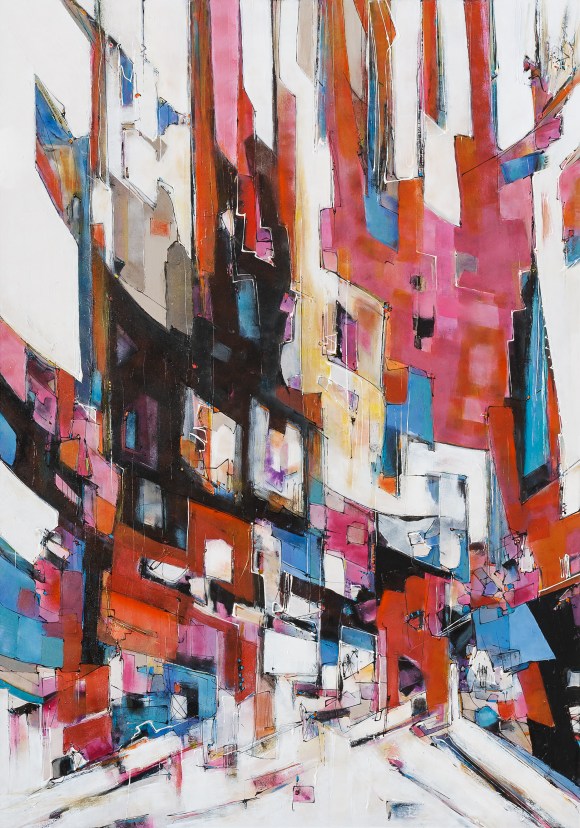
 multiple plausible explanations for something, the simplest one will probably be the correct one. To avoid reductionism, one should add that this rule has a proviso that says “all things being equal”. In other words, it is mostly correct as long as you do not compare answers that put face to face bananas and apples.


 roughout Europe, America and South East Asia.He professes an early love for masters like Kandinsky, Picasso, Van Koenig, Rauschenberg, as well as admiring the clinical genius of Leonardo. His musical tastes were centered around Jazz, blues and classical, but his heart was mostly with the great bebop and hard bop masters like Evans, Coltrane, Monk, Davis, Pepper, Bird, and the golden era of American voices like Ella, Sinatra, Bennett, Dinah Washington, and Nina Simone.