A personal, curatorial & bilingual Blog about: Artistic Movements, my Art, Creativity, Innovation, Design, Leadership, Empowerment, Sustainability, Science, Jazz, Movies and other cool pursuits - Blog personal y curatorial bilingüe sobre: Movimentos Artísticos, mi Arte, Creatividad, Innovación, Diseño, Liderazgo, Empoderamiento, Sustentabilidad, Ciencia, Jazz, Películas y otros temas.
Murray Gell-Mann is an American physicist. A friend and colleague of Albert Einstein, he received the 1969 Nobel Prize in physics for his work on the theory of elementary particles.
He is now 86 and still going strong. He is obviously famous for his scientific studies and most importantly, he is basically known as the father of the “Quark”, which is the name he gave to a minute particle which is a fundamental building block of neutrons and protons, and which he found has very unusual properties.
He also loves delving in other subjects such as linguistics, archeology, and he even expands his views and opinions on the subject of creativity and innovation. During my seminars at the University I draw a great deal of inspiration from some of his very clever ideas. First and foremost, the fact that the Universe is one, and we are part of it. And as part of such a large event, we follow necessarily certain rules that are common to everything that exists within it.
Gell-Mann is not alone. It is not uncommon to hear physicists or mathematicians – even Stephen Hawking, Albert Einstein, Sir Issac Newton before them, and even Aristotle way before all of us – refer to the beauty, simplicity or elegance of equations or theorems and how these characteristics tend to be a good omen that a correct formula is close by (Newton said, for example, that “Nature is pleased with simplicity” while Aristotle made a point in favor of simplicity by advocating as few as possible postulates).
Gell-Mann always tells the story about his 1957 theory on the weak force which he and his colleagues decided to publish. They did so even though it went against seven well know experiments which said something very different. According to him, they did it because they obviously thought they were correct, but the indication that this was so was just the fact that, to them, their answer was a simple one while the other, which was the accepted reasoning, was convoluted and ugly. In time it was shown that Gell-Mann and his friends were correct and all known experiments at the time were wrong.
I always tell my students that simplicity is at the core of all successful enterprises, while overly complex concepts tend to have a much lower success rate, and in the case of initial success, relatively low survival rate. By simplicity I also mean organic, natural, intuitive.
A common example for this, believe it or not, is Facebook.
The core architecture of Facebook is so simple that it almost shocks those who sit down to analyze it for the first time.
I don´t know if it is still going on, but a well-known fact happening at Facebook for a long time was that on the first day of work at the company, the VP of Product, Chris Cox, would give newcomers a remarkable introductory talk. In it he would focus, amongst other things, on explaining Facebook´s product architecture and how it relates to the mission of the company.
When we talk about a company´s architecture, we mean the building blocks of a company, its structure, and how these objects relate to each other and with each other.
Cox, moved by great minimalistic aptitude, describes it in the case of Facebook, as a directory of people, their friends, and their interests; plus a directory of businesses, from global brands all the way to small local businesses. Plus, on top of those directories, a thorough map which basically shows the relationships that exist between all those things. That´s it. No more or less. And that summarizes Facebook.
And it can´t be denied that it is a crystal clear formulation of the product, directly relevant to the mission the company has set, and above all, easily understood by anyone who sees it. It is “beautiful”, it is “elegant”, it is in line – within the corporate cosmos – with Albert Einstein’s famous remark about the fact that he had faith in that “the principle of the universe will be beautiful and simple.”
As far as company´s architectures go, it is beautifully simple, and it is organic to the extent that it is following our everyday interactions, which occur naturally in society, and in doing so it is also helping us to make them richer.
Now, to the big question. Is then the claim that beautiful and elegant answers, as proclaimed by scientists and partially concurred by many who deal in many diverse professions – including myself -, factual evidence or there may be more mundane explanations for this? Does apparent simplicity explain itself or does it hide something else within the underlying structure of reality? Or can it simply be explained by way of sociological, psychological or practical considerations?
Just from the above enumeration of possibilities one gets the distinct notion that things are not that “simple” in “simple answers”.
For a start, it is important to notice that the aesthetics of equations is quite deceiving. An answer may not be convoluted in terms of steps or length because many symbols, which make it look short and “elegant”, involve within their meaning, long and complex equations. What is hidden in all derivative operations is nothing less that long and complex definitions. Thus the “appearance” of simplicity may hide great deal of complexity, and it usually does.
But does this vitiate the argument that “simplicity and elegance” is a good sign in regards to proper and workable solutions?
While mathematicians compress very complex ideas in easily understood symbols, life itself does a bit of the same.
When I say someone is “good”, as opposed to someone who is “evil”, what am I really saying? The concept of “good” requires of a long, and usually difficult to agree, definition. Many philosophers and theologians have spent their lives looking for a formal demarcation without definite agreement. Yet it is one of the most used words, and therefore concepts, in any language.
What has happened is that common consensus has looked to “simplify” its meaning. It is probably an acceptable explanation that a good man
A commonly accepted “Good Man” (as well as “nice & jolly”)
tends to be the sum of the specific interactions between the idea of a person who (generally speaking) does not act against his fellow men, with one who (mostly) acts in a responsible manner, and one who has a certain degree of solidarity, honesty, and social conscience. May also involve concepts such as being a respected and loving father, brother, son, husband, or friend. And so on.
The definition involves a series of terms which act in the same manner as arithmetical “derivatives”, and when put together, they come up with a symbolic word which makes a very intricate but widely acceptable concept into something “simple and elegant”.
The same can be said of anything. Our day to day life involves a constant oversimplification of complex concepts. The oversimplification factor can overlook many nuances but it also makes concepts easily understood and shared by all, and sharing is one of the key factors which make a society into a healthy and growing civilization.
So is simplicity merely the expression that intricate concepts acquire when consensus generates a commonly agreed, albeit limited, explanation? Everything seems to be pointing that way. A flower is a flower but depending on the level of complexity I wish to analyze it, it is a flower or it is something so complex that only a molecular physicist, biologist and botanist can muster.
If it is then a matter of socially acceptable definitions? Can then simplicity be merely described in sociological terms? Is it just a mirage in a wide desert of concepts as abundant as grains of sand? The answer may be resting somewhere in between.
In the same way that the concept of the Universe can be explained in fairly simple and elegant terms, it can also be described as the most complex conjunction of situations, equations, “random coincidences”, and an uncertain prequel and origin we have been able not to ever explain at this time.
Simple answers thus generally hide extremely complex definitions, equations or layered responses which no longer need to be probed as their terms are generally accepted, or because the general description is acceptable on its own terms even if one sees or intuits that a more complex situation lies beneath the surface.
“Simplicity and elegance” may be then a matter of communicating the commonly accepted “look and feel” of something in a terminology that is understood by most at a specific period of time.
As an artist I see this in my own work, and an example of this may be a good way of making graphic something that by now seems so philosophical.
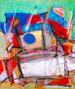
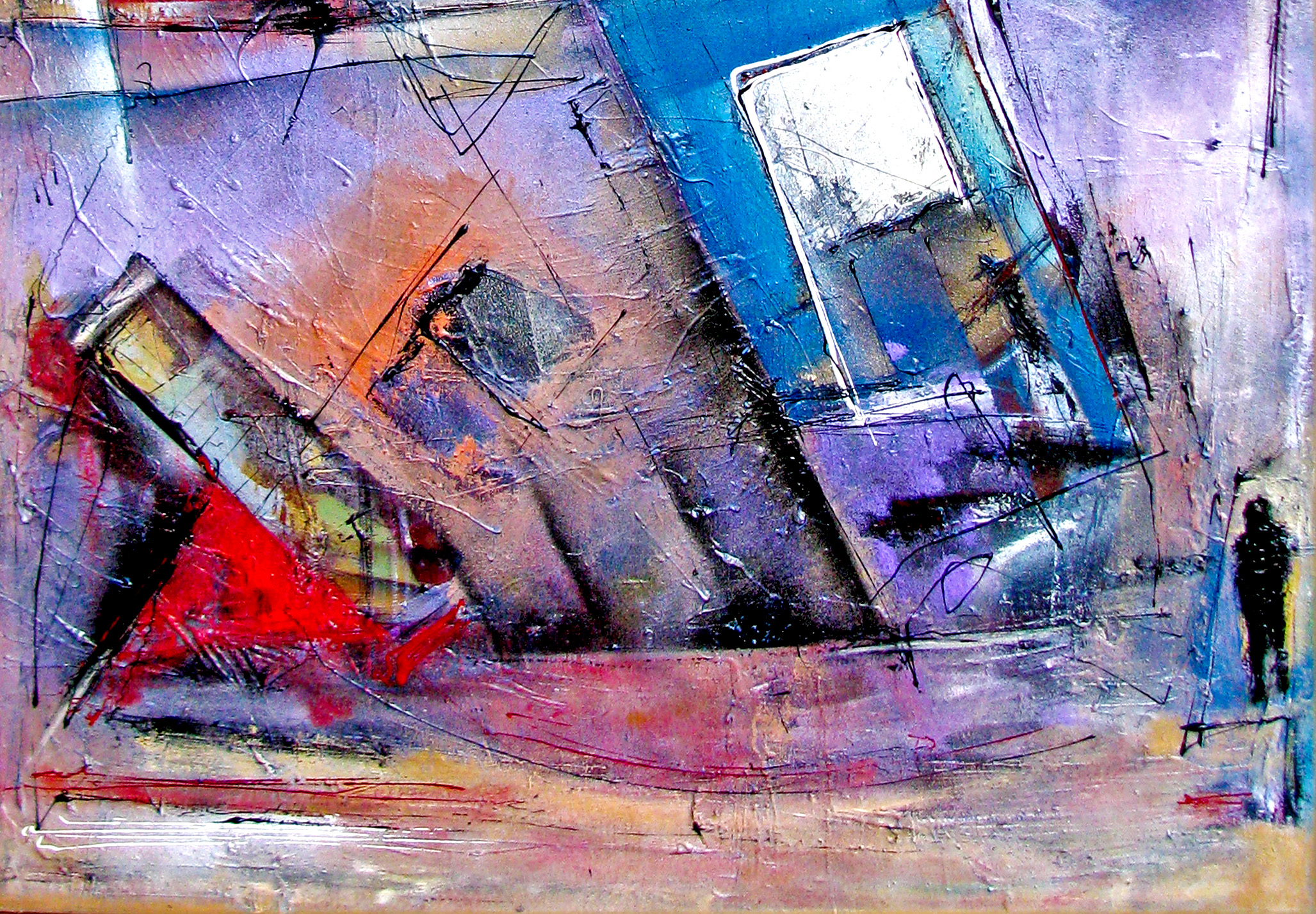
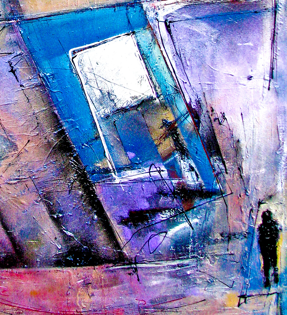
The general perception of a painting may hide a complex underlying theme or pictorial development. Take for example Epistrophy, my painting from 2015.
“Epistrophy” (2015) – Ignacio Alperin
On the surface it seems a conjunction of fairly geometrical forms in, mostly, 4 colors: blacks, ochres, blues and reds. Not that it can easily be understood, but the composition seems elegant and fairly simple. The shapes are fairly geometrical and providing an initial look of something urban, perhaps somewhat adjacent to a constructivism gone a little haywire.
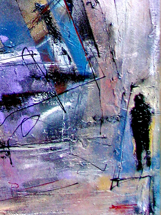
After a longer period of study other things become obvious. There are also perspectives involved. In fact, there are more than 6 purposely conflicting perspectives, including 2 conflicting curvilinear perspectives implicated. The colors are also more than just 4. There are more than 45 colors involved plus their shades.
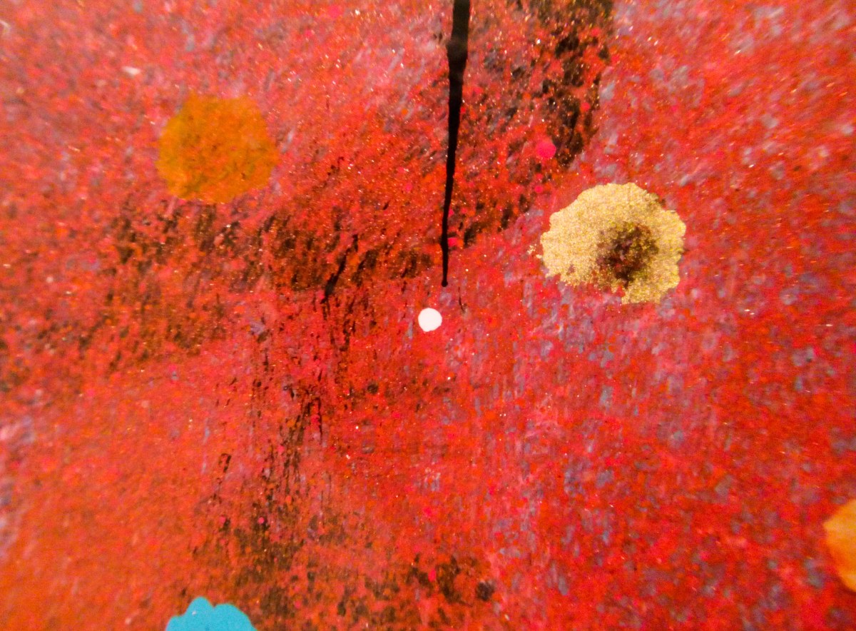
But even in each apparently “solid color”, which can seemingly be described as a red, or an ochre, or blue, there is an immense complexity of detail which gives to the eye the idea of one solid color. There is a minute, almost microscopic world of art, which lives beneath the apparent simplicity of one solid, elegant, simple description of color and which comes to life thanks to macro photography.
This slideshow requires JavaScript.
This is not a fluke. It is in fact by design. And this level of complexity and detail can be found, as I can demonstrate here below with some oher samples, in all of my paintings underneath the superficial explanation of its contents.
This slideshow requires JavaScript.
Thus, apparent simplicity hides a great deal of complexity that most, unless looking for it specifically, need not know. The simple answer exists and it is satisfying by itself. The complexity behind it also exists, and needs only to be known when the simple answer does not satisfy us.
So, having seen that simple and elegant may not be that simple or elegant beneath the surface, is the “simple and elegant answer” rule a good guide?
Even with all the questions still hanging around the subject, I would nevertheless venture to say “Yes”. It is a reasonable model to follow.
There are many reasons but I will just stick to these 4:
In my experience, the answer which simplifies the steps which need to be taken as well as the reasoning behind it, has a tendency to be more widely understood and therefore, more likely to be put into action. And an answer which is widely applied is, by its own definition, probably a correct answer at the time.
An explanation which simplifies a complex issue, and thus adds a certain elegance in a response, is very often the result of relating different occurrences to a single cause. Therefore eliminating unnecessary steps and making the response more widely applied as well.
Concurrently, longwinded, complex (“ugly”), and hard to understand answers or solutions will be more difficult to apply or prove, and thus less likely to be widely adopted, no matter their level of correctness.
This may be cheating, but many scientists and mathematicians have a rule of thumb. Known as Occam’s Razor (so named – or rather misnamed – for the English monk William of Ockham (or Occam), c.1285-c.1349 AD), this concept stands on the idea that if there are multiple plausible explanations for something, the simplest one will probably be the correct one. To avoid reductionism, one should add that this rule has a proviso that says “all things being equal”. In other words, it is mostly correct as long as you do not compare answers that put face to face bananas and apples.
So, is this becoming a dichotomist argument? Are we facing-off ugly vs elegant, or simple vs complex in an impossible battle? In reality, and as we have seen, what seems simple also hides intricacy. As a matter of fact, mothing in life is that easy, but almost everything should be approachable if explained in certain understandable terms. There is no battle here, but there is a probable winner nonetheless.
Whether in business, art, nature, mathematics or life itself, what we understand as answers that are, in relative terms, simple (ie: understandable, elegant, beautiful, non-repetitive, wider scoping, and so on) do run with an advantage over those seen as complex (difficult to fathom, convoluted, repetitive, ugly, non-organic, and so on).
“Simple” – elegant- answers hide within their nature the inherent complexity of life itself, but manage to show their results in a way that satisfy most. And as such, they tend to provide us with a healthy guide towards the right path. Furthermore, and coincidentally, being on the right path tends to also always be a beautiful experience.
“Art is subjective. To each his or her own…”This was part of a comment someone wrote in response to a post I made on a social media platform some time ago.
My first reaction was…”God, how difficult! Another non-response”.
I usually call “non-responses” answers or comments which, on the one hand, cannot be answered or challenged in any possibly intelligent way –at least not without getting its proposer upset- as they are meant to be self-contained statements.
Secondly, they very often tend to veil a strict and rigid view of something under the guise of seemingly defending total freedom.
As I read it, the statement core meaning seems to be (punctuations are mine): “NO ONE can question what art is, and you MUST accept that each one can do whatever each one feels like doing, and it will be ALL art. OK?”.
But if we look at it in a different way, the statement touches on a few of the central concerns we all have.
Mind you, I do not question the fact that we are all free to do as we please, as long as we respect others and nature. Yet, whether we are artists, art lovers, curators, collectors or gallerists, we constantly ask ourselves, and question our responses, about what is the Art paradigm today, and whether we can accept that EVERYTHING anyone does and which is called “art”, can be art.
So here are some thoughts, examples, annecdotes and ideas which will hopefully spark some further debate on this subject.
1. Everything that is labelled as “Art”, is art. Now, is it?
We live in a world that criticizes criticism. As a result everything can be considered “artistic”, and seemingly it cannot be challenged, as challenging it gets catalogued as a restriction on freedom.
BUGATTI REMBRANDT VEYRON
So, I can place a Bugatti in a museum and call it art. Is it beautiful? Sure it is.
Is it art? Well…it is beautiful. And as far as car design goes, it is probably as close to art as car design can get.
But the way I see it, it is not art.
Mind you, this discussion is not new. We have to thank Marcel Duchamp for the modern concept that everything can fall into “art” (the readymade as art is one of his noted contributions), as he looked to break from the rigidity of early XXth Century art dogma.
MARCEL DUCHAMP
Thus, from Duchamp´s 1917´s urinal (Fountain) to Piero Manzoni´s feces in a can, passing by Picasso´s She-goat from 1950 (made from scrap metal he found in the garbage) and Damien Hirst´s dead animals in formaldehyde, it would seem almost anything can become art.
But the truth is that not everything is.
After almost a century, it cannot be denied that there has been change as a result of this new found freedom. But the outcome could be described as both, enriching and confusing.
The pendulum has gone full swing, and subjective reasoning has become something of a new dogma, while seemingly not leaving enough room to discuss the role of objective notions.
For example, I believe there must be an artistic intention, concept or idea, and a substantial endeavor (regardless of the fact that the end result manages to accomplish its initial objectives or not), behind something to be considered “Art”. But sometimes it is not clear how shared is that opinion today.
MERDA DÁRTISTA – PIERO MAZZONI
2. Concepts give non-artists (curators, experts, critics) the intellectual structure to write and sometimes, pontificate about art. But as far as artistic value goes, I feel “We may need a bit more than that from you! Thank you” (ah hum).
For example, when does a concept, idea or statement becomes more than just that. When does it have a chance to become “art”, and how much of a proper development is required before it can be considered art?
At the 2013 version of Buenos Aires´ArteBA (*), probably the country´s finest international art fair, the coveted ArteBA – Petrobras Award (which also carries a substantial monetary reward) was given to Argentine artist Enrique Jezik (*) for his work “Aguante”.
AGUANTE – ENRIQUE JEZIK
“Aguante”(Resistance) was a piece of performance art in which 5 rather strong men, amongst which was Mr. Jezik, held on to 5 flat pieces of rock sheet while a huge excavator tried to break them (the rock panels, not the men).
Besides the fact that this was a rather dangerous exercise, the piece was designed to show something like (I am condensing the whole concept here) “the resistance of the collective against the brute force of those with power, enlightening on the inequality that exists in the distribution of wealth”. It was so difficult to perform at the Fair that the artist simply showed a video of it.
The Jury made up of internationally respected curators, including Mexico´s Cuauhtémoc Medina and Argentina´s Jorge Macchi, found in his video performance a substantial rebellious social and artistic statement, and thus he was awarded the price of ARS$100,000 (close to US$20,000) ahead of everyone else.
Conceptual art is here to stay, but in this case, was the end product art? Was it conceptually new? And whether it was new or not, was it developed enough to become an artistic piece? Was it even inspiring? (Mind you, I am not even getting into the minefield that means comparing it to other work presented).
And I point out, I do not question Mr. Jezik´s quality as an artist. I do not even question the right of curators, critics and experts to do their work, which is of importance. And I admit those concepts are of great help to those who do not have the same sensibility that artists have (most critics, curators and experts are not artists). But if I were asked about this performance, I would feel it barely met any of those basic criteria.
Objectively, the concept was certainly nothing new, as the philosophy of resistance and revolution in art was pioneered by many, including Picasso, more than 70 years ago; the development of the idea was, to say the least, rudimentary; the performance ended up being a little more than a poorly executed video (maybe because it had to be made in a hurry as performance at the Fair was not possible), the performance seemed to leave some doubts about what was the original idea behind it (here is the link so you can judge for yourselves: https://www.youtube.com/watch?v=Vo4HA7jAHYo); and the aesthetics of it, at the very least, questionable.
Although some said that the awarded price of close to US$20,000 may have shown, in this case at least, that in regards to the current “inequality in the distribution of wealth”, he may have had a point.
JEZIK RECEIVING THE PETROBRAS AWARD
So was the price awarded more for his past accolades than for his current artistic “concept” and “performance”? Maybe. Or maybe not. And you can´t help but feel a bit sorry for Mr. Jezik and the criticism he recieved. He did not award the Price to himself. Others were responsible for that. But the fact is that it did generate (that is probably the good news) a great deal of controversy.
So much so that there was even a widely shared fake news item, which spread like wildfire amongst artists in the continent, and which said (photograph of the artists receiving the award included) that Mr. Jezik had been awarded the 2013 Price as a mistake since he had forgotten to attach his work to his award entry. It even went so far as to say that Jezik himself was surprised by the award and did not think he deserved it, as he thought he had presented nothing to the Jury (some people suspect that the fake report was initiated by disgruntled artists who also participated at that year´s award).
3. Money is evil!! (…don´t tell anyone but I love money). I tell you Money is evil!!! (…and yes, I think I would like more money).
This is an annex discussion, like a short detour, but the previous story is giving me the leeway to explore it for a minute.
And this is the issue of money, market, and the rhetoric the art world surrounds it with, so as to not sound too interested.
At the end, whether an artist likes to admit it or not, we are cogs in an economic system. And we all look forward to being able to make a nice living from our art. Yet there is this patina of revolution that “real artists” seem to need to lug on themselves since the early 1900s. And which Awards seem to love.
According to this view, art must be cutting-edge, novel, avant-garde, radical. Preferably showing some contempt for establishment, if it is to be considered “serious” art!
Yet, despite all the talk against money and the market, when we are offered good money for our work, we take it. And the more money, the better it is.
It is painful, particularly to those who really care, but the truth is that as artists we “sell-out” rather quickly. We become “establishment” and enjoy the limelight instantly, even though we may talk the talk and walk the walk of revolution.
Yet, if we think about it for a minute, it is not as contradictory as it would seem. After all, is there anything more laissez faire than saying that anybody can be an artist and everything can be art?
ANDY WARHOL
It was Pop art´s Andy Warhol who said “Art is what you can get away with”. And is there something more liberal, globalizing and representative of the process of offer & demand than that? Few things are, I imagine.
And even though many art elders may say “Don´t talk money, leave it to others” as a commandment to the young artist, supposedly benefiting artistic purity, it was the same revolutionary Warhol who also said that “Making money is art, and working is art, and good business is the best art.” While he went on to add later on in life: “I’ve decided something: Commercial things really do stink. As soon as it becomes commercial for a mass market it really stinks”.
Some may find inconsistency is these statements, but if I may unify both thoughts, he may have tried to simply say that art is a good business, but it is for the few and not for the masses, since when something becomes common place it loses that artistic quality that made it unique (Remember, he does not complain about it being commercial, only about the fact that it has become commercial for amass market).
This is very “revolutionary”, you may ironically think. But remember, being contradictory seems also to be “Art”.
4. It is art because I say so! Or because someone else said so? Ok, well, either way, as long as you buy it, it´s fine…
To most “normal” people (as compared to us, weird arty people), art to be art seems to commonly involve some kind of validation. It can be that a curator or critic has spoken about it, was shown at a gallery of some repute, the media has said something about it, it is being bought by collectors, or it has been bestowed with the golden appraisal of “Museum quality” work. Whatever the case, there is general expectation that something must happen before people will consider something to be “Art”, or even “artistic”.
Is this fair? No, it is not. The fact remains that there are artists creating something every second, every day. But even if it were completely subjective, as my interlocutor asserted in the phrase at the beginning of this article, is it still all art?
Maybe a great portion of it is art. Now, is it any good? Probably only 30% is of some reasonable quality, and a small percentage of that is what could be referred to as good art. And even then, some of what is good may also happen to be beautiful, intriguing, mesmerizing, and even “cool” (as you know, a word I love).
Amongst the art works which may qualify as beautiful, there may be some which have also gained public validation, and some which may have not.
Today, being in the “public eye”, in the old-fashioned artistic sense, is not a necessary condition for artists and for art. There are some circuits that we can create as artists and which do not require of the traditional gallery presence or show. There are private circuits of artists, admirers, investors and collectors, both real and virtual, that work mostly out of the limelight and do so very successfully.
Then, is validation a necessity? No, it is not. But If it is there, it does help. Is it a guarantee? No, it is not either. There is a lot of bad art being validated, and a lot of good art not receiving any of the accolades one expects. But that is just life. The truth is that not everyone gets what they deserve, whether good or bad.
I am one of those who have shun away from going full-on traditional. I have done gallery shows and fairs, but not necessarily in the expected fashion. Maybe it has been my way of managing my artistic timing, or simply that I have seen the advantages of mixing non-traditional marketing tools, like social media, the internet in general, word-of mouth and private gallery shows for collectors, with the more standard fare.
But validation is still important, even for those like me who have moved quite strongly into virtual promotional tools.
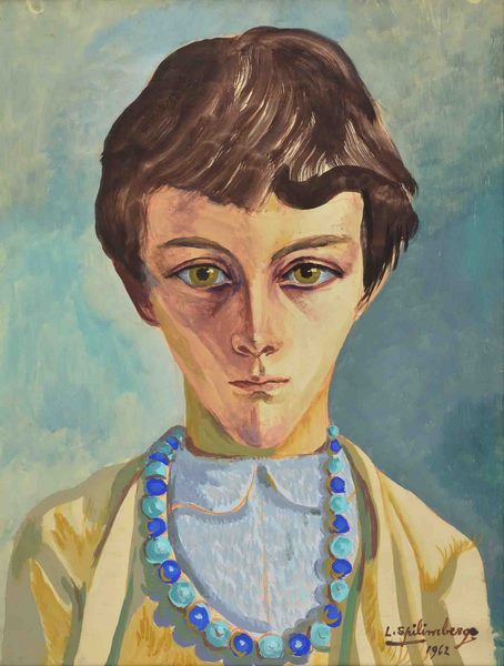
A work of mine was recently acquired by a local collector. He has a very impressive collection of works by some of the best 20th century Argentine masters. Usually, upon a sale, I don’t see where the painting will be ultimately hanged.
But in this case, I was asked if I could take it to his home. And when I delivered the painting I was asked if I could help hang it on a wall. A wall where a portrait painted by the great Argentine master Lino Eneas Spilimbergo (*) had been hanging minutes before (Spilimbergo´s piece was already on the floor and inclined on the wall).
I felt honored, and at the same time, it felt a little like the changing of the guard. It was a most humbling experience and a validation as to how my work is seen today.
Yet, does this validation guarantee the value of my work? No, it does not. It is a hint. It is a small arrow pointing the right way (and my way in this case) but that is all. Does it mean anything about the old master´s current monetary value or the quality of his work? It certainly does not.
CARA DE NIÑA – SPILIMBERGO
5. Redoing what has already been done is not the same as rediscovering it. So the easy applause may soon die. There… it´s dead.
Well, we all strive for originality. We all dream of discovering something new, a new concept, a new way of doing things. But the fact is that very few will manage to do it. Ignorance (particularly in terms of the history of art) is the great ally of artists, both from an artistic perspective and from the perspective of the public.
I see, for example, artists who are currently on the limelight and who work on Junk Art (scrapped metal, garbage, discarded articles, recycled materials, and so on). People who have never seen this type of art are mesmerized, and its popularity grows.
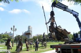
CARLOS REGAZZONI
In Buenos Aires, for example, there is a growing controversy amongst critics because of the amount of public space, particularly in centrally located parks, which local BA artist Carlos Regazzoni (*) has recently been allotted.
Mind you, I don´t know him. Both curators in his gallery are dear friends and I like them very much, and I find him an artistic force in certain respects.
But the argument which has become quite vocal in the local art world (including agitated exchanges by the artist with journalists on local radio), is in regards to the originality and quality of the work, and so the –substantial- amount of recreational areas which are now covered by his metallic structures has come under closer scrutiny.
Now, Regazzoni acquired certain popularity in the last few years because of his fringe gallery, which is placed in the middle of disused railway tracks. There people, enjoying the kind of reverse snobbism fringe galleries usually generate, eat in the tradition of the old fashioned “bodegones” (working class eateries of the 1930´s and 40´s). Simultaneously, he shows his work and that of up and coming artists, hanging on the typical tin walls of the railway work yards and lit by common light bulbs, while people stroll on the dirty broken floors.
PICASSO´S SHE GOAT – 1950
The truth is that the fringe and factory gallery movement, where he finds inspiration for his own gallery and eatery, is more than 40 years old, at the very least. And what is commonly known as “junk art” can be traced back to the work of artists from the early 1900´s onwards. Great artists like the already mentioned Duchamp, Schwitters, Picasso, Tatlin, Archipenko, Laurens, Taebuer-Arp, Janco, Miró, Breton, Rauschemberg, Smith, Soto, Martin, Javacheff, Arman, Cesar, Chamberlain, Beuys, Kienholz, de Saint-Phalle and many more (this is just to mention the most famous which come to mind) who have, in many cases, done extraordinary things or opened up this field.
Furthermore, if one Googles the phrase “junk art”, the result is over 61 million links which cover from the masters to the tens of thousands of artists worldwide who currently practice this artistic style.
So, the originality argument will hardly stand.
The quality argument can also be questionable. Compared to past works in this field, and even current work around the globe, one could argue with certain objective backing, that Mr. Regazzoni´s current series (mind you, I do not question him as a sculptor) can unfortunately only be described as just average.
Yet he has achieved popularity as an artist and as an artistic host.
Someone said that “popularity” is the kiss of death to most artists. Popularity is very close to Warhol´s “massification”, and it does not necessarily imply quality or artistic merit. In many cases it could be said that it implies a combination of commercial mass market hysteria with certain outside factors, amongst which illiteracy from the public, or in this case, about the history of this type of sculptural work in particular, can add to the equation.
And unfamiliarity in art is a great equalizer.
When the public is not that aware of those who came before, it provides an artist with an openly fertile ground to grow. The old (and the repetitive) can feel new and that can be a fantastic environment for an individual. But I feel it is overall a bad thing. What is produced is soon unmasked, as it cannot stand to comparisons.
Ultimately, the creations may feel like mirages, rather than miracles.
And art, from my own perspective, should always aim to be a miracle.
PLACING REGAZZONI´S IRON PIECES IN THE PALERMO AREA, BUENOS IRES
So, is the public space justified?
Probably not in objective terms, but popularity is a great magnet to politicians, no matter the ideology or the nationality. And this is popular art, and it is accessible, although not that original. So it is easy to be tempted to give it a bigger stage, deservedly or not.
What is also happening is that the questioned artist seems to be demonstrably upset with those who have reservations about his current work. He feels like a “one off” and with a fairly long career behind him, he does not relish having to explain himself at his age.
The problem is that all artists, Regazzoni and myself included, dream with the moment when it can be said that we have generated some new paradigm, or that there is some novelty in what we do. That is the art equivalent to a genetically modified spider bite. It suddenly produces in us super power like changes. “Powers” that we need to learn to use correctly.
And as an added bonus to that, this kind of recognition not only should lower the level of resistance that our work may encounter, it also magically allows us to get the financial support that we need to get our larger projects done.
6. So, where is the originality? Where is the ground breaking? Where…? it’s here, it´s just me.
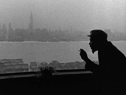
MONK and NYC
As I said before, we want to be remembered as an “original”, and thus beyond questioning. And even if we are lucky enough to briefly achieve it, it may not last, as everything “new” quickly becomes part of the collective unconscious.
The things that influence us are so many, that creating something new for an artist becomes a huge exercise in abstraction from the surrounding environment. So much so that it usually takes so many artists to the edge of something comparable to madness.
In my case, I have a slight synesthesia. It is a benign condition, so benign that until a few years ago it was impossible to diagnose correctly, and nobody cared!
BURT, DAVID AND DUKE
Basically it is something that happens to some of us while still inside the womb, where a tiny section in the brain´s frontal lobe does not develop exactly as it should. Quite an important percentage of the world´s population has it, but most just don´t even know it. Again, it is nothing bad. Quite the contrary, I take is as a wonderful gift.
Synesthesia simply allows us to “feel” somehow the unusual resulting effects of certain neuronal connections (I apologize to any doctor for my very basic description). For example, some people may taste different flavors as a result of hearing singing. That´s just a simple example.
In my case, my slight case simply allows me to “see” shapes and colors when I hear certain sounds, particularly music. I have found that with Jazz, and then Classical music (may be the way they are structured is what helps) this works best.
While I was growing up as an artist, I would try to “control” these impulses. I did my best to keep them far away from my art. I guess I did not want to divert too much from my formal training. I wanted my art to be “understood” and “accepted”.
One day (I was barely 17), I went by to visit a little gallery close to the corner of Melbourne´s posh Toorak and Orrong Roads. I lived only a few blocks away on Toorak Road and I had walked by it several times going and returning from school.
Taking a leap of faith, I went in and asked the lady who owned it if I could show her some of my paintings, as I wanted an opinion.
She gladly said yes, and so breaming with joy I ran all the way home, picked-up some of my “best” paintings and took them back to her gallery. She saw me come in and said, with the serious tone of someone who knows, “Ok, show me what you have”.
As I started placing my paintings in front of her, I saw her from the corner of my eye as she stood up and, with her right index finger unequivocally showing me the door, she said in a very stern voice: “Please! Just take this out of my sight!”
Besides the fact that no one should do this to a young aspiring artist, the episode as traumatic as it was, taught me something.
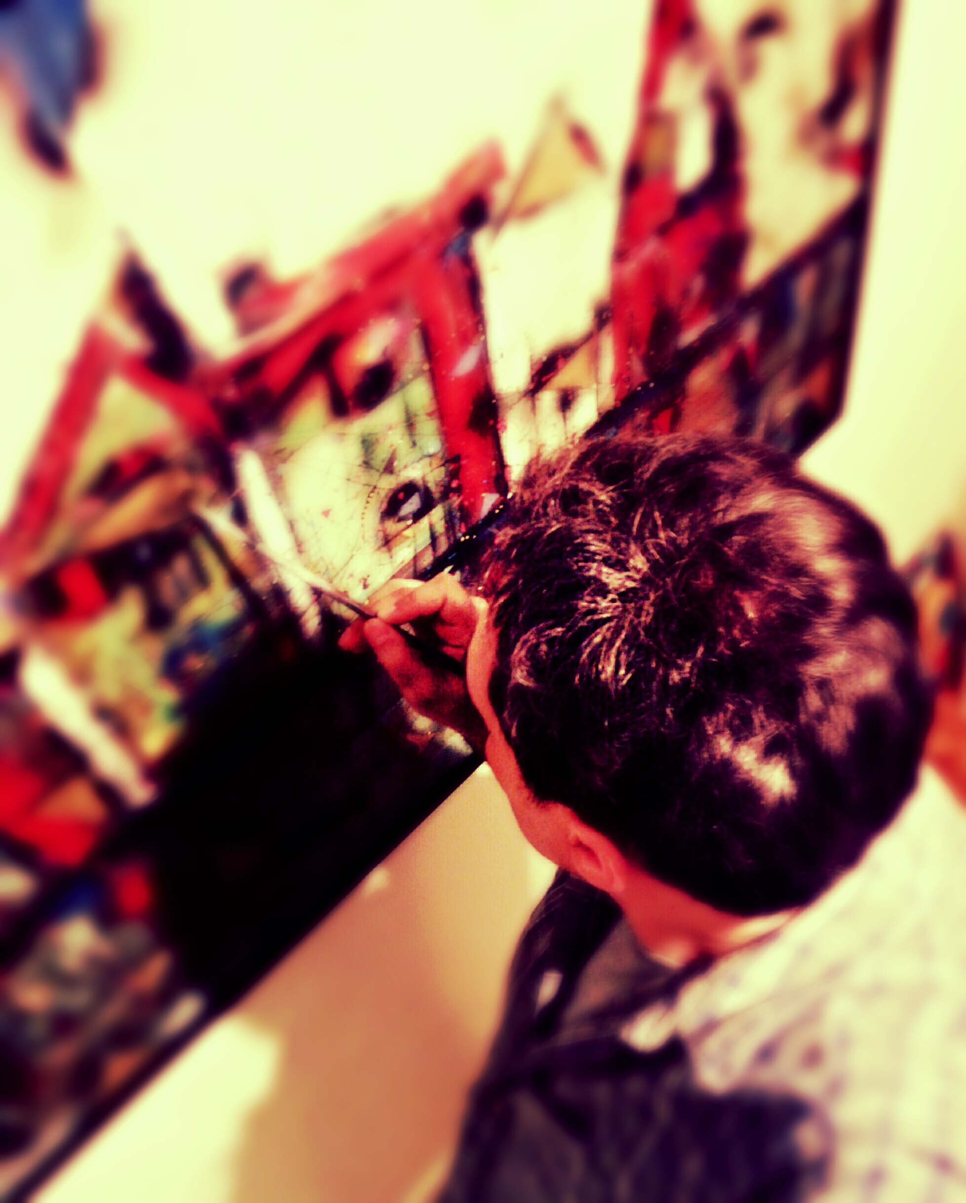
SOUP DE CRAYONS DU JOUR
As time went by, I realized that what made me different (I am not saying original) was the fact that my brain could see and transform sound, and allow me to express it pictorially.
My sources of inspiration were greatly enriched, as they were not only a response to standard visual, aural, and emotional stimulus like everyone else. Instead my brain kept adding abstract shapes and colors produced by its response to music. And the resulting combination was full of nuances that only I could interpret.
That is how I learned that my interest in being “formal” had deprived my work, until then, of that elusive spark that had been there all along. And that same decision had also kept my artistic practice from the sheer enjoyment, and the feeling of freedom, that taking advantage of all of life´s gifts could provide.
7. Another Short Detour Ahead (Just long enough to pick up the pieces of what made us artists)
Like with the point about money, this is also an annex discussion triggered by the previous point. Yet it is worth looking at it for a minute before finishing.
Sometimes, as artists, we tend to intellectualize our work too much. I have been known for making that mistake.
We get caught up in this web of validation. Out of logical interest, or sometimes out of simple fear, we tend to provide hooks and ladders all over the place so as to help those who must discuss our endeavors. That is all good and valid.
Yet sometimes, that conceptual exercise becomes conceptual madness, permeating into our real work. We become prisoners of complex concepts. They do not simply explain what we do, they tell us “what” to do.
As a result, we forget the essence of what has made us artists and our work something special.
Going back to basics is the rule there if we want to save our art. And once again, I am going to be (I apologize) self-referential.
Art involves, as we have seen, many issues. But in its essence, if I may be so blunt, it is basically a structure where we can place shapes and colors in a harmonious, individual, and unique manner.
My synesthesia has helped me in this regards. It allows me to incorporate shapes and colors in a very unusual fashion. Thus it has given be the chance to keep the “basics” very close to my work. The essence is not lost. Quite the contrary, it is always very much up front.
And then everything else must be put in the mix.
In my case, the intention that it be art was always there. The search for something visual that distinguished my work was always the preferred path. I did not stop there. I studied formally, and afterwards on my own, so I could learn on the shoulders of those geniuses I was trying to stand on. I looked at their triumphs and I particularly explored their failures.
Yet those steps, enhanced by life little gifts, allowed me to maintain the essential concepts within a complex cocktail of objective and subjective notions that accompany me in my everyday exploration.
The result is that my work may have become objectively richer over time (at least that is my hope), or maybe simply more exciting.
After all, originality does not necessarily require that something be broken. Instead, it can start from the modest and necessary step of allowing who we are, warts and all, to come through our artistic expression.
We are all unique, and letting that uniqueness show in our art, counts a long way into the originality stakes.
I am still learning as I keep moving forward. Our own Art is something that may last more than a lifetime. And if we are lucky enough, it may even become our legacy. The echo of our footsteps which may still resound for years after we are gone.
8. Viva la Revolución!!!!! Ouch!
As we looked at a few of the questions that are so common to the art world, I endeavored to challenge the concept that art is purely subjective. I think I have, at the very least, established the possibility that certain objective parameters must surround all the subjectivities that art does have as well.
Furthermore, I hope it is becoming patent that the purely subjective stance, very often, can also become something very close to a copout for us, artists. A subterfuge that allows us to put a stop to any questions regarding our artistic quality and, basically, to avoid what we may feel as judgment.
And I know personally how painful for us artists judgment feels. But I also know that from that pain we learn and grow.
Like the popular saying goes, we all learn from our mistakes. And if my goal is to keep learning, I know that what I should keep doing is to take risks, and thus make more mistakes.
Without objective judgment, there is very little to stop us from just conforming. And most of us may just end up doing “arty things” which we might feel deserve accolades they don´t. All this while we do not face the necessary inner questioning, and experience the intellectual insecurity, that can help us drive our art to new levels.
Maybe it all comes back to the fact that becoming true artist is really all about being revolutionaries. But the revolution must be, above all, about ourselves.
As artists, being revolutionaries means being non conformists. It means being prepared to challenge our own standardizations and attack our own artistic weaknesses. It implies resistance to the “average” and mediocre, and a continuous search to artistically exploit what makes us unique individuals and artists. It eventually means questioning our own limits all the time, and pushing the envelope at each turn.
In our own world, that may well be the ultimate objective, and subjective, artistic revolution.
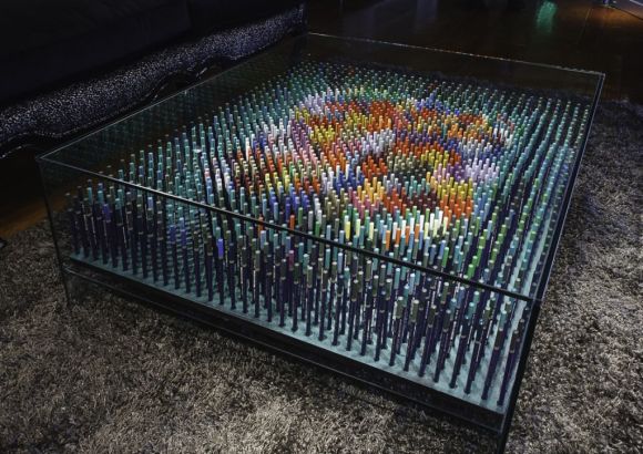
In 2013 I had the pleasure of participating in the 20th anniversaty celebrations of Buenos Aires famous Buenos Aires Design Shopping Mall. As part of these events I took part in Art Deco, an exhibition of furniture intervened by artists, where I presented my “Crystal Coffee Table (a le crayons).
Yet it took me a whole year to return to it and prepare a short video showing the photographs I had taken as I built it. A behind the scenes look, if you wish, on the work I had done.
Even though it does not show the process that went into thinking of it, planning it and any of the other details, I think it shows the complexity and at the same time, simplicity, of preparing this piece.
It also shows how the artistic object changes dramatically as it gets introduced in the cristal table which if anything, is bland and quite non specific.
There is a before and an after on the piece, and the video makes it very clear how the combination of two apparently unconnected ítems generates something new and much more powerful. They generate a completely new object of design, useful and at the same time, artistic
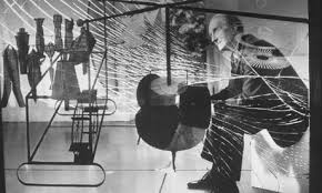
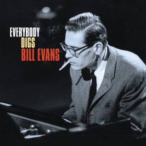
Bill Evans is one of those artists who are constantly present in my work.
This great piano genius was born in New Jersey, in 1929. He passed away in 1980 from health complications related to his hepatitis and his cocaine drug abuse, in what was described by a close colleague as “the longest suicide in history”.
At the height of his career, Evans was as emblematic to jazz and his instrument (piano) as Miles Davis was to the movement and trumpet playing.
He is seen as the main reformer of the harmonic language of jazz piano and was influenced by impressionist composers such as Debussy and Ravel. His versions of jazz standards, as well as his own compositions, always featured thorough changes to their original harmonies. Musical features included added tone chords, modal inflections, unconventional substitutions, and modulations.
Above is an example of Evans’s harmonies. The chords feature extensions like 9ths and 13ths, are laid around middle C, have smooth voice leading, and leave the root to the bassist. Bridge of the first chorus of Waltz for Debby (mm.33-36). From the homonymous album of 1961.
One of Evans’s distinctive harmonic traits is abandoning the inclusion of the root in his chords, leaving this work to the bassist, played on another beat of the measure, or just left implied. “If I am going to be sitting here playing roots, fifths and full voicings, the bass is relegated to a time machine.” This idea had already been explored by Ahmad Jamal, Erroll Garner, and Red Garland. In Evans’s system, the chord is expressed as a quality identity and a color. Most of Evans’s harmonies feature added note chords or quartal voicings.
Thus, Evans created a self-sufficient language for the left hand, a distinctive voicing, that allowed the transition from one chord to the next while hardly having to move the hand. With this technique, he created an effect of continuity in the central register of the piano. Laying around middle C, in this region the harmonic clusters sounded the clearest, and at the same time, left room for contrapunctal independence with the bass. Evans’s improvisations relied heavily in motivic development, either melodically or rhythmically.Motives may be broken and recombined to form melodies. Another characteristic of Evans’s style is rhythmic displacement. His melodic contours often describe arches.Other characteristics include sequenciation of melodies and transforming one motive into another.”
Beyond his brilliance as a pianist and musician, and his technical excellence, Evans managed to imbue his music with a such warmth and melancholy that listening to him playing, even today, generates a deep emotional vibration.
This new work of mine, from 2013 and simply called “An afternoon with Mr. Evans” is one more of the many jazz and Evans inspired works in my own artistic repertoire.
AN AFTERNOON WITH MR. EVANS (2013), ACRILYC, INK AND OIL BASED PAINTS ON CANVAS, 50CM X 65CM, c Copyright 2013 Ignacio Alperin
I leave you while I hope you enjoy these next few minutes listening of this genius playing live in 1972 .
A new painting from 2013, “Finding my way back to you” is a multi layered story that rings true on many levels. We have all probably felt at some point in our lives that strange feeling of loneliness that can permeate everything.
Sometimes it is just a simple need, a longing for some solitude in the middle of our hectic lives. But sometimes it is something much more complex.
Perhaps a realization that we have strayed from our purported paths and we are now alone, facing our worst fears and a dark, sometimes scary road that may, or may not, allow us to get back to where we feel happiest and most satisfied with life and ourselves.
A lost love may take us there, or a seemingly lost life in which we have made some bad or mistaken decisions and where we feel lost, lonely, and in a place where everything feels just wrong.
Whatever the reason, we stand alone at the portal of this individual purgatory.
Hell is somewhere close…we can feel the heat and see the glare of the brazing flames, but we are not yet there.
It all feels uncomfortable and yet we know deeply in our hearts that there is a path that will take us back, and it will be up to us to find it or lose our way all together.
We are paralyzed as we prepare to enter. We stay there and look around, just thinking about everything while we try to get the strength to move forward into this land of contrasts, where the choices may be a far away, and yet very real, fall into everlasting pain; or instead a complex search for self awareness, redemption and truth.
The stairs to salvation are up there somewhere. The setting is asking us to change, to transfigure, to become something else and yet stay the same. Perhaps, it is just asking us to return to our essence.
The location of the entrance to this connecting tunnel is just there for us to find.
The price of our endeavor is high, but finding the peaceful feeling of being back on the true path, the warmth knowledge of feeling true love once more and the reunion with a heartfelt smile, makes it all worth every step, every risk, and every tear.
As always, let’s not finish before we get some music to accompany this new work. It is a great song from Eric Clapton, and it kind of talks about a personal purgatory and his own way of getting back to the warmth of his love. As I said at the beginning, there are many reasons we go through this, and many ways to express those feelings.
The most popular and competing Western languages in the world are English and Spanish.
For the Spanish speaker, the letter Ñ (roughly pronounced N-ee-A ) is like a symbol of this language´s uniqueness.
In Argentina, the top selling literature, arts and culture magazine, edited by CLARIN (the country´s most popular and largest selling newspaper) is properly called simply “Ñ”.
Yes, just a letter, but one that is the symbol of a whole language.
This magazine is published every Saturday and has average weekly sales of approximately 80,000 copies. Ñ, together with the LA NACION´s newspaper ADN (DNA in Spanish, and a different and perhaps more modern way of asserting where its cultural roots are), are the 2 most popular cultural magazines in the country.
I have been privileged enough to have been featured in both at different times, and it is always a proud moment when I can see my work reproduced in such prestigious and popular publications, and particularly when I find myself surrounded by articles on truly amazing local and international artists.
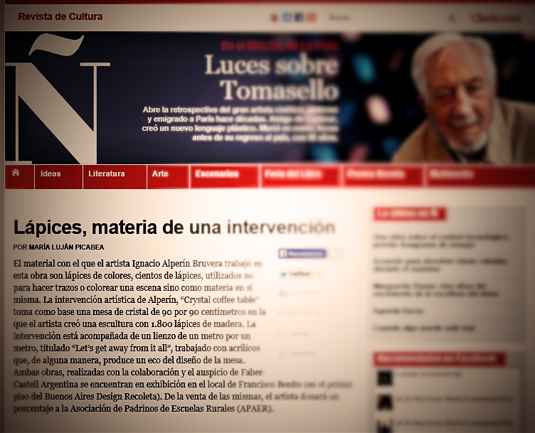
Last Saturday (May 25th ) I was surprised to find my latest intervention, and what has become so far this year´s one of my most popular works (my “Crystal coffee table with color pencils”), being featured on page 6.
It is always fun to see how a writer approaches a piece of work. I still remember a short article in the same magazine a couple of years ago, in which a journalist with immense generosity, compared and intertwined my work in my “Visual Jazz Series” with Julio Cortazar´s writings and his love for Jazz (for an explanation of how my art and music are interconnected, and particularly Jazz, check out “Jazz means freedom” at http://wp.me/pN8b8-9s ).
This time the reporter took a more clinical approach, which oddly enough I feel it is the right way to look at the piece.
First of all, because only a live viewing will reveal a certain depth and 3 dimensionality, that cannot be explained through a photograph. Secondly, because the piece is intriguing and that fuzziness is better left for the viewer to unravel, rather than subject it to an explanation that can only partially encompass all that it has to offer.
And I can only invite you, if you can, to have a look at it live at the Buenos Aires Design Shopping Mall, where it will be on show for a little while longer. And if you can´t, do not worry, at the very least I have some great pictures from the great Fabian Cañás which I have published here previously and on Facebook for you to look at and enjoy. I hope you do.
As everyone who knows me (www.ignacioalperin.com) knows, I am a maker of art and a lover of both art and music, particularly jazz and all its variations.
I have always endeavored to put both artistic forms of expression together, looking to synthesize them into new creations.
I have managed to do my own thing, but my love for the works of great geniouses like Kandinsky, Picasso, Van Koenig, Rauschenberg, and Pollock amongst others, will show through.
In music, even though my tastes are usually expressed in terms of the great bebop and hard bop masters like Evans, Coltrane, Monk, Davis, Pepper, Bird, and the golden era of American voices like Ella, Sinatra, Bennett, Dinah Washington, and Nina Simone, I am quite eclectic. I love classical music, tango, blues, soul, hip-hop and I can find inspiration in almost any tune that I enjoy, no matter its style.
Like I always say, music deserves a great deal of the credit in my art. “Inspiration is easy to find when you are perched on the shoulders of genius” is my usual response.
As I slowly entered into the realm of object design and sculpture, music was also there to inspire me, to make me “see”.
As many of you have seen, I recently introduced my latest piece at Art Deco, an Exhibition of intervened objects by well known Argentine artists, which took place at the Recoleta district in Buenos Aires in late April.
My design is quite simple. An all crystal coffee table within which, just like a transparent jewel box, In which I placed a sculptural piece made up of more than 1800 Faber-Castell Goldfaber artistic pencils standing perpendicularly and making up a colorful and airy version of the painting that lurches beneath.
It strikes me that every person, whether young or old, who has stood in front of the finished table ends up drawing out a big and happy smile. The color pencils create a link to something very familiar, something warm within each one of us, and initiate the communication with the viewer immediately.
This slideshow requires JavaScript.
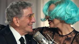
The idea of using pencils for this intervention came to me as I watched a Tony Bennett documentary a while back. I already had the crystal table and listening to that genius sing made me close my eyes, and suddenly I saw it. It was like a clear box full of candy, the idea of the beautiful color pencils used as objects d’art instead as of instruments was born. I know others have explored this avenue, but I think I have managed to make it both artistic and utilitarian, with a cool twist. I am happy with the results and with the reaction of the public. It has been a wonderful experience.
And to me, it is important that my art also has that COOL factor. It is a style and it is a message. Art is not something rigid, stuck somewhere in an impregnable limbo. It is something to be enjoyed. My art is a message of fredom and cool, for all to enjoy, in any way they wish to enjoy it.
And of course, preferably at home, after acquiring it!!! 🙂
And talking about cool, enjoy the images of my latest work while you listen to the new 60’s Jazz scene B&W video of Justin Timberlake’s latest (featuring Jay Z). It seems that JT, just like me, also likes doing his thing with a Suit & Tie.
Until the next time!
Ignacio
—————
Art and Design: Ignacio Alperin Bruvera
Photos: Fabian Cañas.
Painting accompanying the table in photos: “Let´s get away from it all” (2012) by Ignacio Alperin Bruvera, 100cm x 100cm.
Argentine contemporary artist Ignacio Alperin Bruvera has been in the news lately.
An already established artist with international exhibitions on his resume, Alperin has explored the pictorial side of music with his long standing “Visual Jazz” series.
A lover of art and music since an early age, particularly jazz and all its variations, he has always endeavored to put both artistic forms of expression together, looking to synthesize them into new creations.
The result is a well recognized style, art that has a hidden and well rehearsed structure within a sea of improvisational skills, rhythms, colors and cadences.
His art is very personal, baroque at times, simplified and beautifully succinct at others. His works takes on many forms, and yet his hand and his vision is always recognizable.
Alperin was born in Argentina, grew up in Australia, and circumstantially lived and traveled throughout Europe, America and South East Asia.He professes an early love for masters like Kandinsky, Picasso, Van Koenig, Rauschenberg, as well as admiring the clinical genius of Leonardo. His musical tastes were centered around Jazz, blues and classical, but his heart was mostly with the great bebop and hard bop masters like Evans, Coltrane, Monk, Davis, Pepper, Bird, and the golden era of American voices like Ella, Sinatra, Bennett, Dinah Washington, and Nina Simone.
He says that the music deserves the credit for his art. “Inspiration is easy to find when you are perched on the shoulders of genius” he often asserts
In recent times he has slowly entered into the realm of object design and sculpture.
Diving into art and design: The Table
He recently introduced his latest piece at Art Deco, an Exhibition of intervened objects by well known Argentine artists, which took place at the Recoleta district in Buenos Aires in late April.
His design is exquisitely simple. An all crystal coffee table within which, just like a transparent jewel box, he has placed a sculptural piece made up of more than 1800 Faber-Castell Goldfaber artistic pencils standing perpendicularly and making up a colorful and airy version of the painting that lurches beneath.
The result is a masterfully creative piece, almost constructivist, full of tridimensionalities, nuances, shadows, and optical illusions. There is substance and lightness, color and darkness, and above all a joyful sensation of being in front of something that is creative and new, yet familiar.
This slideshow requires JavaScript.
From the author:
It strikes me that every person, whether young or old, who has stood in front of the finished table ends up drawing out a big and happy smile. The color pencils create a link to something very familiar, something warm within each one of us, and initiate the communication with the viewer immediately”.
The idea of using pencils for this intervention “came to me as I watched a Tony Bennett documentary a while back. I already had the crystal table and listening to that genius sing made me close my eyes, and suddenly I saw it. It was like a clear box full of candy, the idea of the beautiful color pencils used as objects d’art instead as of instruments was born. I know others have explored this avenue, but I think I have managed to make it both artistic and utilitarian, with a cool twist. I am happy with the results and with the reaction of the public. It has been a wonderful experience.”
“To me a color pencil is like a time machine. It is one of the very first objects that we consciously remember from an early age. It is a magic wand that explodes in colors and lines. It is something that accompanies us throughout our lives. A great grandfather in his 80s will pick up a box of color pencils and for a moment, he will be a 2 year old again. That is the time machine aspect I refer to. It is a connection with something very essential and very warm within us, and a vehicle that takes us to whatever point in our lives we want to go.”
“A gentleman told me at the exhibit that whenever he opened a new box of color pencils with his grandchild, the smells and the sounds of those colorful wooden sticks would just make him happy and warm all over. Something like that is what I was looking for with this intervention and those who view it. I hope I managed to achieve it”.
Art and Design: Ignacio Alperin Bruvera
Photos: Fabian Cañas.
Painting accompanying the table in photos: “Let´s get away from it all” (2012) by Ignacio Alperin Bruvera, 100cm x 100cm.

 characteristics tend to be a good omen that a correct formula is close by (Newton said, for example, that “Nature is pleased with simplicity” while Aristotle made a point in favor of simplicity by advocating as few as possible postulates).

 conjunction of situations, equations, “random coincidences”, and an uncertain prequel and origin we have been able not to ever explain at this time.
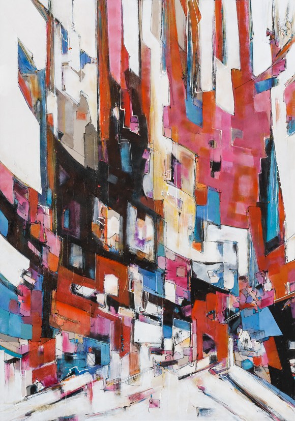
 multiple plausible explanations for something, the simplest one will probably be the correct one. To avoid reductionism, one should add that this rule has a proviso that says “all things being equal”. In other words, it is mostly correct as long as you do not compare answers that put face to face bananas and apples.


.png)


 roughout Europe, America and South East Asia.He professes an early love for masters like Kandinsky, Picasso, Van Koenig, Rauschenberg, as well as admiring the clinical genius of Leonardo. His musical tastes were centered around Jazz, blues and classical, but his heart was mostly with the great bebop and hard bop masters like Evans, Coltrane, Monk, Davis, Pepper, Bird, and the golden era of American voices like Ella, Sinatra, Bennett, Dinah Washington, and Nina Simone.